Component Guide
Table of Contents
Intro to Components
Components allow you to maintain a consistent, efficient, and scalable website by creating customizable blocks from elements and child elements. Reuse those blocks across your site, and modify them in a single place to avoid individually revising each recurring layout. Throughout Lumos components are used for Navbars, Footers, Buttons, and specific sections or layouts like a CTA section. This page should get you up to speed on how to edit components and also includes a list of the components used in this site below. For a full guide on using components check out the Webflow University page.
Understanding component properties
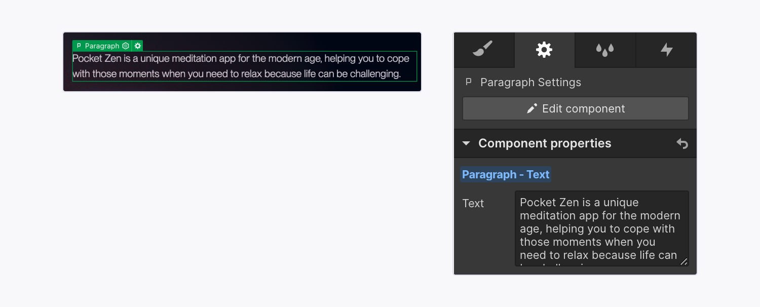
Component properties let you modify specific aspects within a component instance like text content, an image, or even a layout or color theme. If a component has a lot of different properties they will be sorted by what aspect of the component they are updating eg (Styles, Heading, Paragraph, Image etc)
To edit a content property (eg a heading or image) you should:
- Locate the component instance that contains the element whose values you want to modify
- Select the element on the canvas
- On the right side of the designer you will see a properties panel - most section components will have a large amount of properties sorted into different dropdowns, you can open and close these to just look at the specific type of property you are wanting to update (eg Heading properties)
- Modify the element’s property values (e.g., update the text, replace an image, set the visibility, etc.)
Note: Some components (like a Navbar) might not have any properties set up because instead of having the component include different content on each page it needs to be consistent across the site without any parts of it changing.
Updating styles within a component
Lumos allows you to update visual styles within some components by using component properties. Since each component property is given a name (and often a placeholder) use this to understand what modifying that property will do to the visual style. For example, if you update a heading font styles from h3 to h1, it will modify how the heading looks..
In general, the most important style properties are setup using component variation dropdowns. This makes it easier to know what the options are and not make unintended changes to a component.
Other custom properties allow you to select a CSS class for a specific use case (eg changing a border radius, or max width). To view all the possible classes for each of these use-cases checkout the style guide.
Feel free to play around with these properties when modified a component to see what visual changes are available. That being said it is recommended to clear out any overrides of a property if it is not having any effect. Eg. don't write something the doesn't work into a Class property like dark or 10 if those options don't do anything, just leave the property blank (you can click on the blue text in the property to reset it to its default option).
You should only add utility classes (classes that start with u- ) inside component properties.Component Slots
Some components allow you to put other components inside of them for even more flexibility (like putting a bunch of cards into a section). to do this you can simply drag a component from the sidebase into the canvas and re-arrange them how you want, or even copy and paste another component to create more of them.
It's important to note that while Webflow will allow you to put any component inside a component slot, not all slots are meant for all components, (eg, sections should not be put inside other sections) to solve this components are divided in the sidebar based on their role.
If a component slot is supposed to hold a specific type of component it will be named accordingly (eg an FAQ List's slot is named FAQ Item's so you know to put those inside the list.
Closed Components
There are several prebuilt closed components that are entire sections (or cards) meant to make building new pages easier and more consistent. Use these components wherever possible to make it easier to make global changes down the road.
The prebuilt sections all start off with the name of Section / followed by the name of the layout.
The prebuilt cards start off with Card / followed by the type of card they are
Open Components
The open components allow you to make more customized layouts if you need to create a section with a more unique layout or set of content.
Open components can give you more flexibility but require you to assemble them yourself out of several layers of components, if you want to stick to prebuilt layouts you can totally do that.
When making custom open sections use the following structures as a general guide and customize from there if need be.
Simple Content Section
- Section
- Layout
- [Content Slot]
- Eyebrow
- Heading
- Paragraph
- Button Wrapper
- Button
- [Visual Slot]
- Image or Video
- Image or Video
- [Content Slot]
- Layout
Custom Cards or GallerySection
- Section
- Layout
- [Content Slot]
- Eyebrow
- Heading
- Paragraph
- Button Group
- Button
- [Visual Slot]
- Grid
- Cards or Images
- Grid
- [Content Slot]
- Layout
Component Naming Conventions
One other thing you'll notice is that components have different types of names related to how they are used. Prebuilt components this will include several words or phrases separated by a slash. This is to help you quickly search through and add components. The most common keywords are explained below:
- Section - These are pre-built sections that you can drop onto a page and have specific style controls for, when creating new pages they will help you quickly fill out the pages with prebuilt responsive designs
- Card - These are elements that are used inside of a component slot, giving you more flexibility on the amount of content inside each component
- Layout - There is one primary layout component but more might be added if need be for more unique layouts.
- Icon - These are icon elements, they can be dropped into icon cards, or list items.
- Form - Any element related to a form will have this prefix, You can use the Form component and drop fields into it to create a custom form (see an example further down the page).
- Inner - These are components that were used to create internal parts of specific components and shouldn't be utilized on their own.
- CMS - These are Collection lists that were turned into components to allow them to be used inside other components (sliders, tabs, or open sections). Often CMS components will hold a list of cards and give you control over filtering, and sorting the CMS items along with grid options for how they are displayed
Interactions within a component
Some components will allow you to enable or disable interactions by using true or false (eg Scroll In Interaction = true). Or may give you more detailed options like allowing you to choose between a few different animation types, or giving you options for duration. For more details on how to customize these interactions check out the documentation.
One helpful example of an interactive component is the slider component. This allows you to drop in any type of card component and have an interactive slider that is customizable based on responsive sizes.
Note: If there are any interactive components or attributes,(like the custom video player, or scrollin interaction parameter), that aren't working as expected this is either because fully setting them up wasn't in the scope of the original project or I didn't anticipate you needing them and so I didn't include the code in your github repo to optimize performance, just reach out and I can help figure that out for you.
Editing a Main component
To make the same changes across all instances of a component, you’ll need to edit the main component. You can edit the main component on any component instance by entering design more and:
- Double-clicking the component instance
- Right-clicking the instance and choosing Edit component
- Selecting the instance and clicking the “pencil” icon in the label
- Selecting the instance and clicking the Edit component button in the Style, Element settings, or Interactions panels
- Selecting the instance and using the keyboard shortcut Enter
When you do this all other elements on the page will get a dark overlay to show that you are updating the main component and that any changes to it will affect all other instances of that component.
Important: In general you don't want to edit the main component, leave that to your developer, in most cases you'll just be updating the component properties to modify a specific instance of the component.
Lumos Chrome Extension
If you are using components a lot I would highly recommend installing the lumos chrome extension - It will pull out values from the custom code to make it easier to see what your options are when modifying a components styles. Chrome extension is linked here.
Components in this site
Below is a list of the modular components on this site (cards, buttons, typography, icons etc). To view a more robust page with example sections click here.
Components
Icons
Other UI Elements

John Doe
CEO & Co-founder
List Heading
Text subtitle with a description
List Heading
Text subtitle with a description
List Heading
Text subtitle with a description
Cards

Heading
Lorem ipsum dolor paragraph text
Increase in profits
Lorem ipsum dolor sit amet, consectetur adipiscing risus tristique posuere.
John Doe
CEO & Co-founder
Custom Card Wrapper
Lorem ipsum dolor sit amet, consectetur adipiscing elit.
Basic Elements

Forms
Filters Simple
Filters Advanced (duplicate this)
Comparison Table and Table Rows
Basic
Pro
Elite
Features
Feature Text Here
2x a day
Hourly
Unlimited
Feature Text Here
500
1000+
Unlimited
Feature Text Here
Item Text
Item Text
Item Text
Feature Text Here
Item Text
Item Text
Item Text
Collaberation
Feature Text Here
Feature Text Here
Feature Text Here